Art In Hand
atiya jones

waiting for summer, #1 and #4,
The original version of these images were paintings made with “Black #3” acrylic paint on a wooden panel.
For this exhibition, the works have been recreated as two diptychs using a thermoform printer on Swell paper. On a sheet of 11” x 17” swell paper are two squares measuring approximately 7.5” x 7.5.” The left side of the page is where “waiting for summer #1” is located. Throughout the image are recessed, white, curvy lines that do not connect, reminiscent of snakes in motion. The raised area surrounding them is black. They vary in length and width and are spontaneously placed. Although they are static, they are moving towards one another almost to suggest that they are searching for one-another. The second square, on the right side of the page is “waiting for summer #4, ” which features recessed white lines similar to those in the previous image. However, near the top right corner is a ladder with a curved horizontal line beneath it, indicating a method of entering a body of water.
Another interpretation of the connected lines might be a train track or the famous Pittsburgh public stairs.
On the other sheet of Swell paper are the same two images, printed inversely. Here, both images feature a recessed white background, with soft, black wandering lines. There is a raised black border to indicate the boundaries of each image.
Both diptychs may be interpreted by hand from any direction. In the center of the paper, ⅜” of an inch from the bottom is a circular logo with a stylized version of my initials, “AJ” in the middle.
“waiting for summer #1 & #4” are a part of a new series extending from a body of work I call Brain Maps. As an abstract artist, I use mark-making and specifically lines to create self-portraits and interpret my emotional well-being. I have been inspired to create this series as a celebration of being able to feel excitement and anticipation, versus perpetual anxiety, or depression. The lines that connect represent experiences I love to have in the warm weather: walking along train tracks; seeing where a flight of Pittsburgh stairs might lead me to; lowering myself slowly into a cold pool.
Frances Metcalf

Riverbank Riverbank done in a technique called encaustic. This technique uses melted beeswax. I created Riverbank using beeswax that was ladled onto birch plywood. One small collagraph print was placed on the wax and pressed down so it would adhere. A second collagraph was cut into strips and placed in a stacked fashion and pressed into the wax. Once the prints were in place, and the wax had cooled considerably, I used a heat gun to soften the wax just to the melting point. This was done to ensure that the wax would stick to the plywood. I also used black markers to draw on the wax.
The art itself is on a rectangular piece of wood 12" high by 24" wide. There is a gap of about ¼” between the wood and the frame that surrounds it. The frame is about ½” higher than the surface of the piece itself. Art and frame together measure 13” high by 25” wide.
The basic texture of this piece is flat, cool, hard wax. The wax itself is not evenly smooth; rather, it has some ridges and unevenness. The wax itself is somewhat variegated in color, running from almost pure white at the top to honey-colored pale yellow at the edge of the river bank. Heavy-weight pieces of paper lie on top of the wax; the colors on the papers are shades of purple, green, ochre, with hints of red, brown, and black.
The river itself is formed by a flaw in the wood surface that is approximately 1 inch wide running horizontally across the bottom of the artwork. That flaw is very rough in texture, contrasting with the smoother texture of the wax.; it flaw creates a depressed surface, about an eighth on an inch lower than the main surface of the wood. Below the flaw is another 1-1.5 inch of smoother surface, coated in very pale yellow wax. Two flat, black trees are drawn in marker on the wax surface. These cannot be distinguished from the wax surface by feel.
This particular piece of plywood was my inspiration. Since work done in encaustic is often done on wood because the weight of the hardened wax is too much for paper or canvas, I bought an entire sheet of birch plywood to have available to use.
When I bought it, I asked for it to be cut into various sizes, including 12 x 24. When I was selected wood to work on, I saw the flaw and I immediately thought of a river running through a landscape. While working on the piece, I wasn’t exactly sure what would enhance the landscape, and discovered two small prints that I had done previously. I liked the colors, and felt by adding them it would complete the idea of flora and fauna growing alongside a riverbank. The trees got added as an afterthought, but I love them.
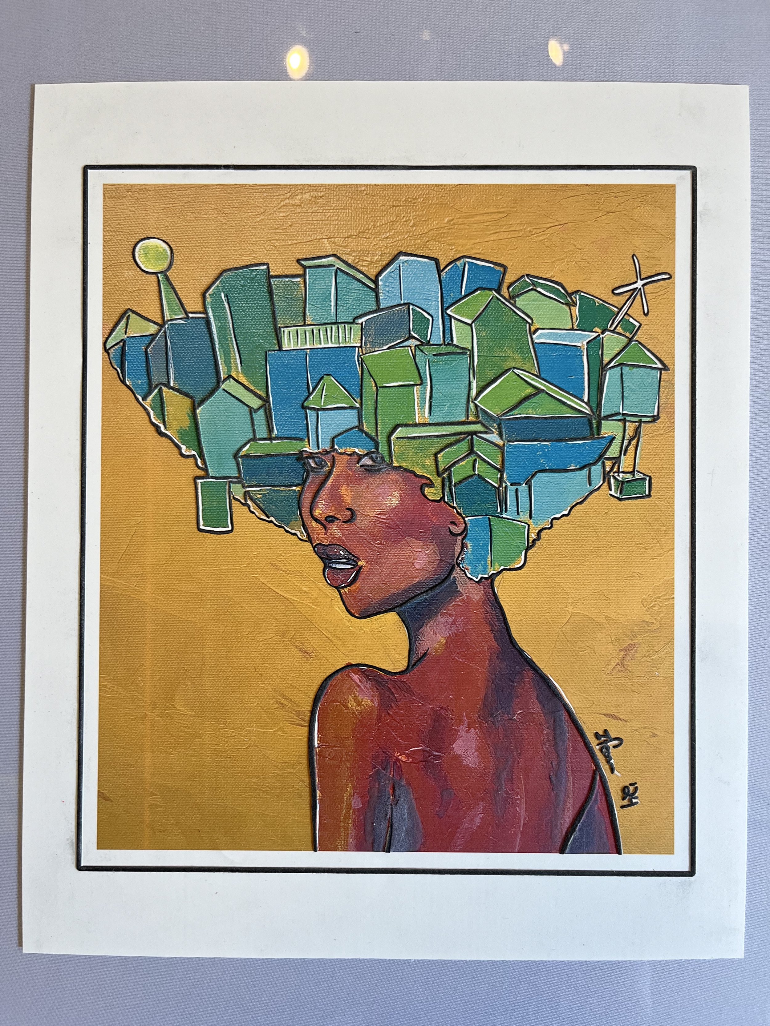
Ifeoma
Swell paper print
11" x 17"
Originally created as an acrylic on canvas painting, this piece is modified with swell paper to bring out the texture in the work. The swell forms the outlines of the image, separating it from the background. For the original painting, I used yellow oxide paint in combination with metallic bronze in order to create a textured background, using a combination of paintbrush and palette knife techniques. The foreground is an image of a young brown-skinned woman looking back over her left shoulder, with a confident look in her eyes. Her hair is the shape of an inverted triangle, with a city painted as its contents using a paintbrush and acrylic markers. Using cooltoned hues of blue, teal, green, and white, the city appears densely populated, with a variety of building sizes, flags, windmills, and lighthouses protruding from the hairlike structure. The original size of this piece is 12 x 12 inches.
This piece is part of an artistic series titled “The World We Carry” where I ask, “what would it look like if we could see each other’s inner world. In the paintings, I use literal representations of humans wearing their worlds as a crown or as their hair. I love creating pieces where I take concepts and phrases a bit literally and see what I can create visually. The result is often a surreal/ illustrative representation of these ideas. This painting looks at a woman’s confidence in knowing that things will work out. She created a world for herself that she loves, her inner world speaks life into her as she moves through her days. I love creating pieces that provide a positive feeling, or a sense of hope even in a challenging time. This piece allowed me to continue to explore this desire. Currently this series overall is ongoing with a combination of smaller and larger works. I am happy to be able to share a piece of this artistic journey.
Kennedy Deen

Concrete, Plaster, Burlap, Nails, Expandable Polyurethane Foam, Blacklight Pigment, Resin, and Acrylic on Wooden Panel
65” x 12”
I wanted to create a specific abstract environment that used color atmosphere and materiality to achieve it. I imagined I traveled to a toxic, desolate planet where my goal was to bring back a soil sample to be tested.

Expandable Polyurethane Foam, Spray Paint, Acrylic, and Fabric Paint
13” x 11”
I wanted to practice my skills in color theory, so I created this triptych to resemble three major elements within color theory. Each one individually represents hue, value, and saturation.

Expandable Polyurethane Foam and Fabric Paint 35” x 10” x 8”
Polyurethane foam is a medium that causes a lot of material waste. I wanted to create a sculpture that used the leftover foam from other projects to create a new sculpture. After mixing up the liquid, I would pour the rest off my desk and allow gravity and chance to play a role in its form.
Lisa Belloli

Acrylic paint and translucent heavy acrylic matte gel, on stretched canvas.
36"x 36"
The canvas is covered with abstract, geometric shapes painted in primary colors, red, yellow, and blue and secondary colors, green, orange, and purple plus black and white. I laid outlines of hands cut from paper on the painted canvas and traced them with the heavy acrylic gel. I used more gel to create texture around the handprints so when you touch the piece, the smooth areas are the handprints.
This work was created for this exhibit. When the curator, Mónica Ortiz-Menier visited my studio she took particular notice of the tactile quality of my mixed media work. I’ve always looked at my work as a mix of objects but not as a mix of textures. It is such an intuitive process I didn’t see it until it was pointed out to me. I shouldn’t have been surprised, I walk through this world touching everything I can, trees, flowers, plants, fabrics, yarns, stones, animals, just about everything.
The outline of hands is a common motif in my work. For this work, I ask for hand outlines from family, friends, and chosen family. There are three PhDs, two in mathematics and one in engineering plus another engineer, artists, mothers, fathers, grandmothers, grandfathers, aunts, uncles, brothers, and sisters, even a set of fraternal twins. The ages range from almost two to almost seventy.
Our hands are our hearts, we say hello and we say goodbye with our touch, with our hands we make skyscrapers, and we make bread, we make war and we make art.
Meg Prall

18 x 22 inch wide rectangle
This work is a small hand-latched rug made with synthetic acrylic yarn. Hundreds of 4-inch lengths of yarn are looped around a hooked tool and knotted individually onto a base of rough cotton webbing. The edges are then folded over and finished with more yarn, stitched with an oversized, blunt darning needle.
The base color of the rug is a neutral light tan. Spelled out in dusty rosy pink, are the letters FEEL FREE in all capital letters. When you run your fingers through the pile of the rug, you can feel the soft, smooth tendrils of yarn. If you touch the back of the work, you can feel the rough texture of the cotton base webbing and the bumps where each piece of yarn has been knotted one by one.
I have always enjoyed work that required repetitive motion. Knotting the yarn with the tool hundreds of times is like meditation for me. This rug was created specifically for this exhibition.
In my notebook, I keep a running list of dozens of short phrases and words that are pleasing to me. Occasionally, I will pluck one of these phrases to be used in my work. I chose the statement, “FEEL FREE” as an invitation to touch the work and handle it however you would like.
Mónica Ortiz-Menier

Mixed Medium Canvas
20" x 24"
I chose to create my version of Monet’s famous Water Lilies. I decided to bring the beloved rubber ducky from my era, the 21st century, into one of my favorite 20th century impressionist artist’s paintings. This is a Tactile Pop Art Style for my friends who might never have had the opportunity to see for themselves a Monet painting with their own hands. My hope is to break the barriers of fine art and to create a new style of art so people who cannot access art through vision can through tactile means.
Reba Harmon

Cotton, polyester, cardboard, wood, ink
24" diameter
My soft sculptural textile work often explores ideas of place, home, and the evolution of memory. My work also investigates growth systems and thought patterns by always looking for the smaller parts that create the whole. This particular piece is representative of individuals having similar but different recollections of the same event.
Sara Tang

Polish polymers and coffee on salvaged corroded metal
13" x 8"
I am entranced by bits of old ephemera and pieces of past lifetimes, including those of my Italian relatives who immigrated in the sister ship to the Titanic and settled in Monessen along the Monongahela. I have been involved in historical reenacting over the years and I have sometimes thought of how my existence as a child of an interracial, interfaith marriage would have been stigmatized and not possible in the past. Thinking of what someone like me would have looked like had she lived in this area from the late 19th to early 20th century, I created this cameo portrait from many delicate layers, set in a strangely beautiful backdrop of an old corroded industrial landscape.